
At a Glance
Client
Erika Castle
Challenge
The Black Tears series required book covers that would capture the tone of the novels, establish a recognizable series identity, and appeal to readers within the genre while allowing each installment to maintain its own visual identity.
Role
Book Cover Design • Typography • Art Direction • Series Branding
Approach
- Created a cohesive visual language across multiple titles while giving each book a distinct identity.
- Used typography, imagery, and composition to reinforce genre expectations and emotional tone.
- Designed the series with consistency in mind to strengthen recognition across future releases.
Outcome
Developed a unified cover system that supported the author’s growing series while creating a recognizable visual identity for readers.
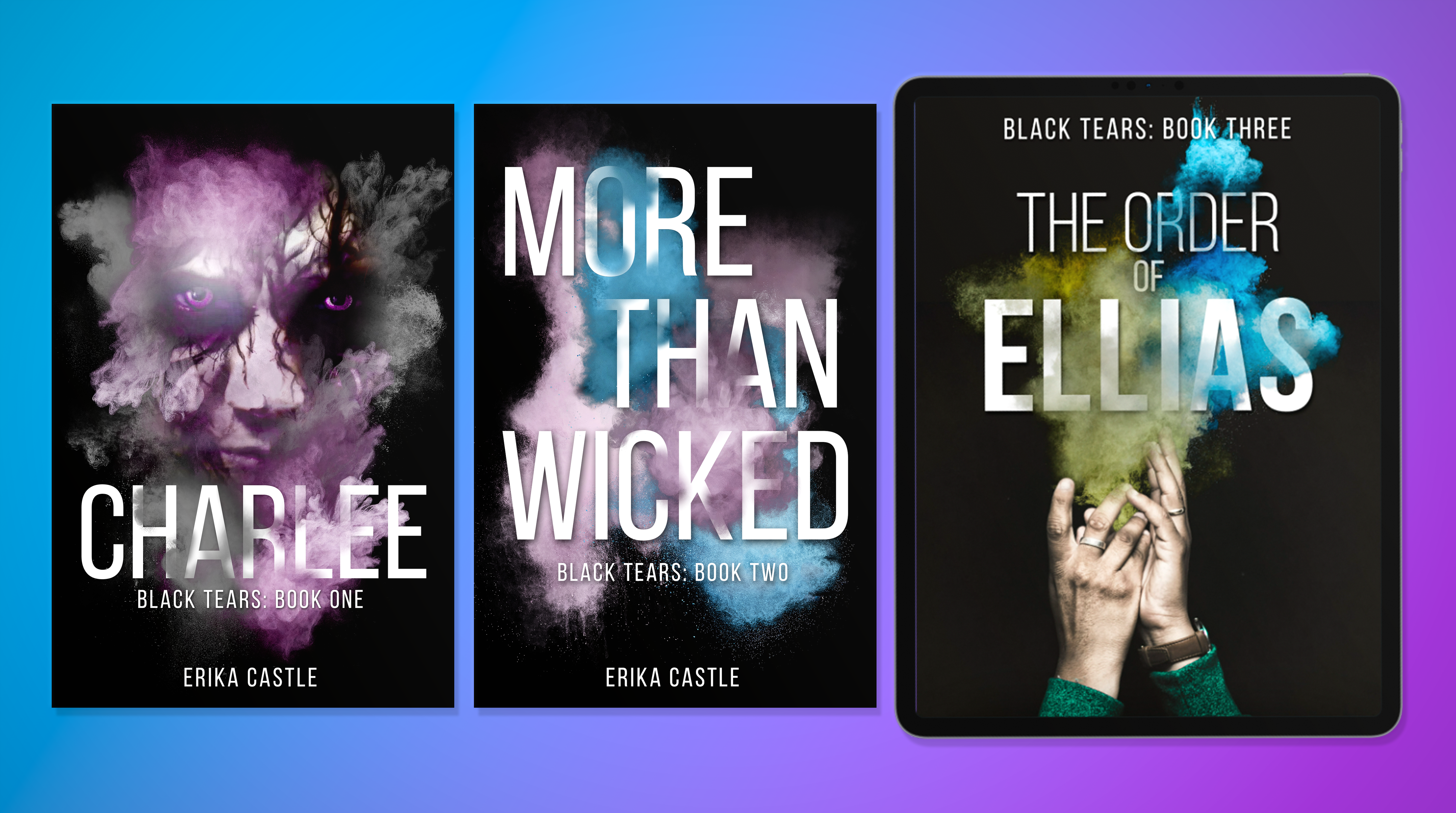
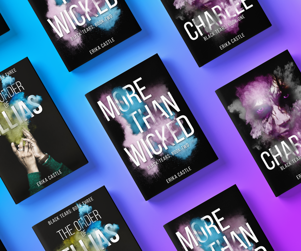
For Erika Castle’s Black Tears series, I designed a cohesive set of eBook covers that reflected the unique themes of each book while ensuring consistency across the collection.This series required a balance between individuality and cohesiveness, and I successfully created covers that showcased the unique tone of each book while maintaining a consistent visual identity for the Black Tears series.
Book One – Charlee: Redesigned an existing cover provided by the author to align with the aesthetic of the upcoming books in the series. The goal was to create a visually striking design that set the tone for the series, while also harmonizing with the subsequent covers.
Book Two – More Than Wicked: Modified a pre-made cover from my shop to fit the author’s vision. This cover defined the design for all other covers in the series.
Book Three – The Order of Ellias: Designed the final cover, completing the series with a design that tied together the visual elements of the previous books. The design maintained the series’ consistency, ensuring a unified and professional appearance for the entire collection.
Check out these projects as well:

 Lyn Vicknair