
Client
Lazy Lady
Challenge
As the blog evolved, Lazy Lady needed a refreshed visual identity that better reflected its personality while creating a cohesive brand experience across its website and digital platforms.
Role
Brand Identity • Logo Design • Visual Systems • Creative Direction
Approach
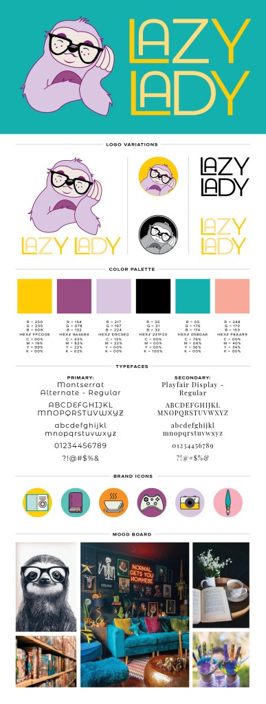
- Redesigned the logo, typography, color palette, and iconography to create a more modern and versatile identity.
- Developed a visual language that could be applied consistently across the website and social media.
- Balanced approachability with a polished aesthetic to reflect the brand’s broad lifestyle content.
Outcome
Created a refreshed brand identity that strengthened recognition, improved visual consistency, and provided a scalable foundation for future content and growth.
Since its launch in 2010, Lazy Lady has been a creative hub for readers seeking lifestyle inspiration, with a focus on mom life, gaming, simple recipes, art, photography, and bookish content. As part of an exciting redesign, I created a fresh new logo, updated fonts, a vibrant color palette, and unique iconography to elevate the brand and align it with its diverse, modern audience.
The new logo captures Lazy Lady’s approachable yet stylish personality, incorporating clean lines and soft, versatile colors that resonate with readers who love creative and relatable content. The typography strikes a balance between elegance and readability, while the updated color palette adds warmth and vibrancy to the brand’s visuals.
Thoughtfully crafted icons enhance the blog’s visual identity, providing cohesion across the website and social platforms.
This redesign not only reflects Lazy Lady’s creative spirit but also highlights its love for storytelling and bookish charm, creating a polished and inviting look for its growing community of loyal followers.
Check out these projects as well: